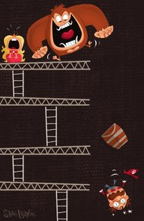
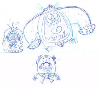
Commentary? This one was a wee bit tricky to figure out. My first take on this idea was a little more complicated than the result. I've been trying to improve on my posing a lot recently so I decided to try pushing things a little further than I normally would. Get something nice and dynamic vs the stiff crap I usually do. Here are some early thumbnail sketches. Nice and loose...playing with ideas, figuring out composition.
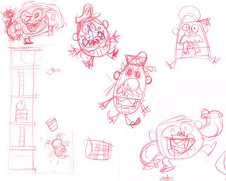
Starting to play with Kong's shape. Maybe he could be shaped like a banana with arms? Then where do I attach that right arm? Bah!
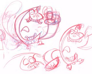 The end result was this, which I was pretty happy with (except for the shatty princess). Interesting shapes, minor symmetry.....a teeny monkey ceck.
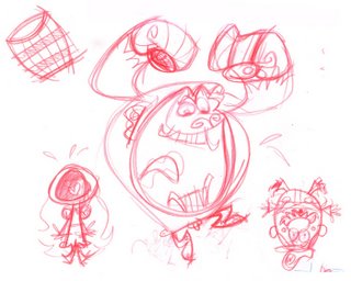 Well...when I tried frankensteining that all together in photoshop, on top of that thumbnail up top, I ran into problems. It just didnt read. Things felt too complicated and it just wasn't communicating. I think it was the shapes. If this was a closeup, it could work.....but as a long distance shot, it didnt. I had to try and simplify the shapes. Anyhow, after more sketching I got this:
 Better! Now theres visual clarity...rectangle Princess, square-ish Kong, and an oval Mario. Is it as exciting posing wise as the earlier version....no. But the shapes are much simpler and they communicated a lot more clearly. It's definitely not perfect...especially all that symmetry.. grrr!! But it works.
I'd be interested to hear other peoples take on this. Did I make the right choice? Was there a better solution? Am I sweating over this stupid thing too much? Yes...shaddap, Steve.

55 comments:
kong has never looked so good
Dude, you got it spot on, although your eariler roughs were also rad, I really do think you made the right choice!!!
To bad about that digital nonsense stuff, Its a great illustration. Brings me back to those early days of childhood, curled up in front of the brain drain box and rotting my brain away on to much Nintendo!
awesome illo! captured nicely. the crying princess cracks me up!
Kong is so funny! I never know what I'm doing most the time either, with posing and stuff. But it makes me smile so I think Donkey Kong is a success. Although, I don't think Princess Peach was in the Kong games, it was another girl, named Polly or something, if you want nit picky comments. :P
Steve this piece looks great! I think that you did make the right choice on this one... It can be very difficult to throw away drawings that you find appealing. That's the sign of a true artist.
Going back to basics on this one was probably a good idea anyway, given the subject matter. (Simple Game = a clear and simple design) I think you captured it perfectly.
It's too bad that the contest disallows entrys from an entire group of artists that 8 bit games argueably influnenced more than any other.
Love the blog man and keep up the good work.
"It's too bad that the contest disallows entrys from an entire group of artists that 8 bit games argueably influnenced more than any other."
My sentiments exactly. To me it makes no sense and almost takes a self contradicting approach. Eh, I guess it happens, either way its still a fantastic piece. Initially I was drawn more to the banana shaped ape, but the rendition you chose conveys far better. Great work
You made the right choices man... and you can never put too much focus on decisions like these.... I've got it on my desktop... ON MY DESKTOP I SAY! so rock on with your bad sef!
dude, thats super cool!!!!
you could pass it off as traditional ;) Really great! loved that game
love the sketches dooder!
Sweetie, this piece looks great. Sorry the whole contest thing didn't work out..still looks amazing though. I would award you first prize..
Hi Steve,
I've got some theories for you. If you want 'em, you can email me since I don't want to be a jerk and give you unsolicited advice.
Nick
dude these rock, i think the final choice you made is awesome, some of the earlier sketches were a little more dynamic, but this one looks the most 'nintendo' looking if taht makes any sense. awesome.
Cool pic, Steve! Bummer about the "no digital". Ironic, yes, but I guess if it's about old-school gaming, maybe it's about old-school techniques...
Love all the rough sketches. I'm partial to the Mario in the upper right corner. Peach is perfect. (and I think Brianne is thinking of Daisy...?) Kong is cool, but you shoulda kept that lil' curl on top of his head...very definitive. (Also maybe some +++ teeth?)
http://redruth.greenbean.org/~ben/
4CR/smb_super_synth.swf
ha! this is awesome man...funny monkey knob on the doodles, you shoulda put it in the final...what am I, like 10 or something?!? oh wait...i work in animation, right.
It´s cool!!!
Ha,Ha,Ha,Ha,--Damn these are good!:)
I love the second from the bottom! Great action pose! Although your changes made sense in terms of clarity. Beautiful design and process Steve!
LOL As Mario falls DK says take that barrel too while you're down there. HA! Poor princess.
I think the whole thing could pass for traditional too. Since Donkey knocked out Mario. Does this mean your icon will be Donkey??
That's really cool!
funny stuff lambe
Nice stuff man! The Tinkles box is great. So authentic looking.
My bad, wikipedia says Mario's first girlfriend was Pauline. Ergh I need a life. I wish this piece was going to be hanging at 88. It'd be nice to see it there.
http://en.wikipedia.org/wiki/Donkey_Kong
THis is V COOOL!! Classic game style with AWESOME modern twist!!
you are my hero....well, one of them anyway...this feckin' rocks!!! Tho you left of his "ceck"...hehehe.
YAAAAYYY! This is soooo GREAT!!! Man I love old skoool! Great progress!! Fantastic style! Keep rockin those pages!
I really like the princess!;D
Steve, your piece is friggin beautiful! I was gonna submit to 8-bit too, but I was crushed by the no-digital art clause too (well, that and seeing some of the competition) There goes my hope of creating the only painting inspired by Rampage ever...=)
Dude, this is awesome. I think the final piece is a total success. Yes, there is symmetry or "twinning" in regards to Donkey Kong's arms, but if you look at the game, they didn't care about that stuff, so in regards to this piece, I think it works beautifully!
really cool donkey kong art, Steve!
There are a million ways to skin a cat, but all I can say is upon seeing the finished image, I totally knew what it was and it made me smile.....so I think you ultimately succeeded!
It's great seeing your toil over various revs of the same concept. As long as you keep thinking of ways to improve your work, you'll continue to get better and better.
Bravo!
Hey Mr. Steve! :)
Yeah, i agree, the image was INSTANTLY clear and it brought a smile to my face just as fast!
really nice stuff... as always, you rock AND ya make me a bit jealous!
haha
great work, man!
-Dagan
Well I've had a good look at your Blog and your stuff is GREAT !!
I swear I commented on this already...
Oh well you heard all the nice words - we talked it up last week :)
Let's run our own contest where digital work is allowed! No longer will we sit at the back of the bus!
You Rock DOOOOOOOD!!!!!!!
Hah hah ha, greaat :)
Even though I like your idea of DK being shaped like a banana, I think your final result turned out the best.
woah! awesome take on a classic
Very very very awesome!!
Excellent work Steve! You must really love Nintendo! Your comentaries are great!
Sweet, this is awesome! You Rock! I dig the simple shapes.
Cool! Funny and full of character!
fantabernackle!!
esta chillin'
robin
could i BBBEEEE anymore criptic!hehehehe!!
NIce one!
awesome!!! i love kong's teeth.
Too cool, made me laugh.
I got nailed by the "no digital" claus too. Buncha bunk is what that rule is.
Love your comments, nice to hear about doubts and struggle... makes me feel I´m not the only one..
:D
i love it! your stuff is awesome! very inspiring. i do like the 3rd sketch you did quite a bit. that kong is really cool.. but what you ended up with is excellent... thats so stupid the "no digital" clause.. i understand what they're trying to do.. but hey... its 8-bit! i'm linking you.
I can believe I didnt see this already .. Damn Steve.. Keep killin it man.. Super Hero!!!!
S!
crazy cool sketches!!!
Steve
www.stephenstudios.com
Really fun! I think all of the choices turned out great!
I'm really enjoying your flavor here. Cale Atkinson showed me your blog here, awesome work. Kudos
聊天室,豆豆聊天室,哈啦聊天室,尋夢園聊天室,聊天室尋夢園,080中部人聊天室,080聊天室,080苗栗人聊天室
情趣用品,情趣,情趣商品,愛情公寓,情色,情色貼圖,色情小說,情色小說,情色文學,色情,做愛,寄情築園小遊戲,色情遊戲,AIO交友愛情館,AIO,色情影片,情色網,微風成人,嘟嘟成人網,成人,18成人,成人影城,成人圖片,成人貼圖,成人圖片區,成人文章,成人小說,成人電影,麗的色遊戲,自拍,A片,AV女優,AV,A漫,視訊交友網,視訊,視訊交友,免費視訊聊天室,免費視訊,視訊聊天,視訊聊天室,UT聊天室,聊天室,豆豆聊天室,哈啦聊天室,尋夢園聊天室,聊天室尋夢園,中古車,二手車
Post a Comment