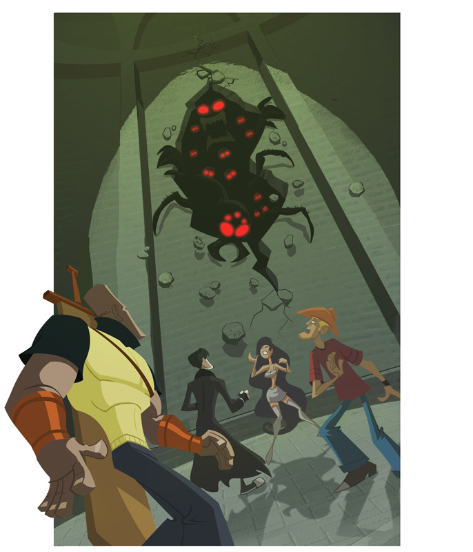
It looks cool, even without your trademark (and awesome) textures. The spider creatures look really great, specially with the effect the glowing eyes give.
What is this for, or is it classified at the moment?
What the crap is this?! and where are the textures?!! :)... No seriously man, this is nice, especially for something that's not your "strongsuit". I think it's engaging, dynamic, and eye catching and lets face it, you can't go wrong with huge spiderish monsters with red glowing eyes. I'd run away and then feel ashamed about it later. Peace!
I like the angle and lighting in the scene. Maybe it needs to be pushed more with the foreground being darker to focus the attention to the spiders. Ohh and maybe parts of the wall is coming at them, like BAMM! A BUNCH OF BUGS HAVE COME TO TAKE AWAY YOU GUYS' HOT CHICK...or something like that. Nice Steve!
Yo steve-o, Really cool stuff, great composition, I really like the low eye level. Nice color choices too especially regarding the subtle greenish light fading down the wall, really makes those glowing red eyes pop. Me likey.


17 comments:
It looks cool, even without your trademark (and awesome) textures. The spider creatures look really great, specially with the effect the glowing eyes give.
What is this for, or is it classified at the moment?
ven
What the crap is this?! and where are the textures?!! :)... No seriously man, this is nice, especially for something that's not your "strongsuit". I think it's engaging, dynamic, and eye catching and lets face it, you can't go wrong with huge spiderish monsters with red glowing eyes. I'd run away and then feel ashamed about it later. Peace!
thats great steve!!
Always good to mix it up a little, I say. Looks good!
Yay new stuffs! I like the spiders, I hope they eat the people. Go spiders!
I like the angle and lighting in the scene. Maybe it needs to be pushed more with the foreground being darker to focus the attention to the spiders. Ohh and maybe parts of the wall is coming at them, like BAMM! A BUNCH OF BUGS HAVE COME TO TAKE AWAY YOU GUYS' HOT CHICK...or something like that. Nice Steve!
Beautiful Composition! Not your strong suit?! Thats a pile of horse apples! Nice Job, Steve.
Great angle Steve!! Nice little change here. ;)
Inspirational man!
Wow Steve! How dynamic! It feels so different from what you usually do but man, the quality is never any less!
Chutastic!
actually, it's nice to see a fresh take on the action/adventure genre. good job!
Oh goodness, Mr. Lambey! Everythings your strong suit! STRONG TO THE MAX! lolz. This is beautiful! Hope everythings been ace with you! :^)
Steve looks very cool. Like the composition of the characters and the angle. Here is my drool, double of 'urs.
Yo steve-o, Really cool stuff, great composition, I really like the low eye level. Nice color choices too especially regarding the subtle greenish light fading down the wall, really makes those glowing red eyes pop. Me likey.
word to yo mutha.
That is one sick illustration! Looks like a comic cover. I really dig the overall style and color palette.
Beautiful work. Solid thru and thru.
Steve,
It's the Ghost of Picture Critique Past and I say "poppy-cock and bawlder-dash!!!!!!"
Good Stuff!
Your Humble Admirer,
-d
Really good artwork! But I make me imagine what happened to things come up like this to the guys with the bug... crazy... Congratulions
Post a Comment