
Bad news! I've been so busy with work that I have nothing of quality to post yet. Boo!!
In the meantime, I'll post some these super rushed sketches from last night. I'll put up the finals, once they're completed.

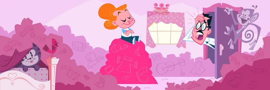
Update: Base colors are done. "Photoshop fluff" on the way. Oh ya...any gaps in the composition (to the left of the girl for example) are going to be filled with a caption box.
P.S. I've added to new links under the friends tab. Please check out the new blogs of "Oscar_Miah" Alcorn and "Mr. Boose" Glideswell. They're swell!
27 comments:
Fun drawings!! These are great!
These are great man! Darn you and your artistic goodness....Can't wait to see the color stuff. Later tater!- Miah
Really nice composition on these, and I like how you handled the staging problems, especially that first one. . It's always nice to see the rough sketches. The finals are amazing to look at, but the roughs do more to inspire my own drawing. Thanks for posting!
wow, i thought my room was a mess...
At first i was like, "how'd she get birds on there!"
then I saw the monkey.... HA!
Fun stuff Steve...
Theres something different about the lil girls design....
IT seems to be a little more
3-D-ish then the stuff I'm used to seeing from you...
i think its the 3 quarter legs mostly...
I like it!
Nice color scheme!
Looking noice, Steve. That girl's got quite a schnoz on her.
Thanks guys! Glad to hear some of you like the compositions. I think I'm pleased with them too. The characters on the other hand...bla! Very boring. I was hoping to have the time to go back and do something interesting with them, but these are all due friday, and I've got other freelance assignments piling up. Got to let it go...sob!
Javi: I get the urge to try and add more form every now and then. I've been eyeing Miah's stuff, and he seems to walk that fine line between form and style very nicely. Hoping some of that will rub off in mine.
Jtruss: Ha...maybe I took the snooty thing a little to far. Just trying to add something unique to each character.Not every experiment is a success...heh heh.
I marvel at your abilities sir. I don't think you are capeable of a weak illustration. Your color, design. and character are rock solid appealing. On a side note,..the girl in that picture looks like a mini you with a ponytail.
ps ---also glad to see you posting process shots. I really enjoyed the one that accompanied your interview on the Character design blog.
Hey Steve-O.
Are these for the Disney Adventures? How do you get a theme or do you decide the content? Interested to hear more.
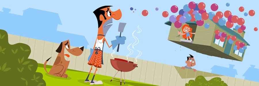
And hey - What is Jasen Strong doing in than middle panel? And for God's sake - will he please put a shirt on!!!
I can say some good things - but the posse already did. The color is looking good so far. I imagine different palettes for each. My favorite is the bird on the bedpost - ultimate cute.
Dave
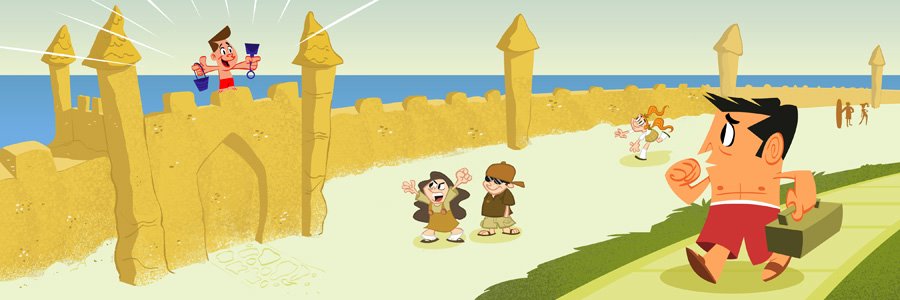
nice colors and compositions. i like the squashed design of the red shorts walker. really funny!
Man! Just awesome!
I second the motion to see more sketchwork accompanying finals.
looking good!
I love how these turned out! Thanks for Oscar's and Mr.Boose's link.
Awesome stuff, Steve! Thanks for the kind words and the link posting! (I've returned the favor) You've gotta be working on TEENAGE ROBOT, right? Your stuff has that cool feel. (I like the Roy Nelson-inspired piece on your site, too) Always excited to discover a new artist with a cool site; I'm gonna hafta buy some of yer sketchbooks, too, man...
OH MAN these are great!
The one with the floating house is hilarious. I really like how these turned out.
the middle one dude. One of the best ones I've seen from you so far, composition and color wise...
Hi! Steve, Thanks for your kind words and I read your interview as well. Like this blog very much and I'm pleased to know that u also work in flash.
Fun drawings! I love the colors in the middle one!
there are no gaps in this compositions. Even if no text...
these are all nice dude...
I shall unbutton my shirt just for you.
I too love the middle one with Kim Possible in the floating house... However I was immediately attracted to the hot pink and harmonized colors of the top image.
Design wise, I think I actually like the solid sand castle in your sketch more that the lumpier final version. I guess I just think it's a bit funnier that this nerd could actually build a castle out of sand with straight edges and solid structure. He probably used a protractor. Those nerds...
No problems with the comps at all though. Love that dog in the middle too. Where his shnoz blends with his smile, great shape.
Terrific, Steve! Gahh! Colour! How do you make it work so well?
fab, Steve! fab! you are a master of color!
Hahaha!!! That guy with the barbecue is genius!!!
beautiful work, congratulations!, i love it (^_^)
I feel happy by looking at it!
FANTASTIC!! Its so cool to see the rough drawings and then the finished product. Great design, colors and composition.
The color world is fantastic! And great forms. Very Inspiring!
Post a Comment