
Suprisingly enough...the stage that takes the longest for me is color. I could spend hours just doing variations. It's both a fun and fustrating at the same time. It probably stems from the fact that I dont really know what the hell I'm doing.
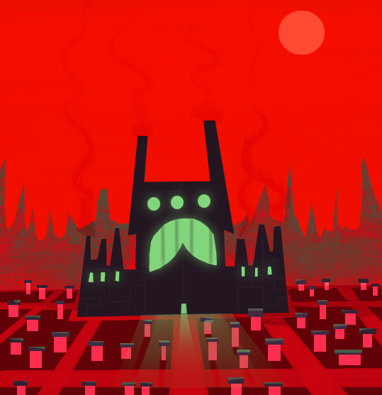
So in an attempt save time and keep my sanity, I've tried doing to do quick 2-3 minute color thumbnails. Here's an example from of a layout I was recently working on. Special thanks to Mr.Sean Scott for the permission to post ;)
23 comments:
A building of fear...nice representational piece.
Dig it.
=s=
Don't know what your doing???--Who You kiddin?? Beautiful stuff man, love the colors/design.
Not that you need it of course, (I think your choice of colors is awesome)but this site has always been a great resource for color palettes for me. I fall in the rut of always using the same kind of colors, and I think this site pushes me a little. For whatever it's worth.
www.colourlovers.com
Nope...complete redo..JJ. Looks good to me man, and I know the final is going to turn out awesome as usual. Long live big scary factories, small tiny houses, and fire engine red!
good stuff!!
u seem to have colours down to me!!
:)
Very nice setting.
I agree with you that the colouring process is always very demanding. But you have really succeeded here.
This looks great Steve-O,
Don't know what the hell your doing!! PARRUMPH!(I just farted on that statement.) This is beautiful. You can never go wrong with complementary colors. I love how you built contrast using the super saturated red with a desaturated green. The green also adds an eerie feeling as to what goes on inside the building.
I LOVE IT!
wow.
I agree with Martin. Sweet study! yay chatty mctalksworth
The houses look like little tombstones - which really helps give this an ominous look.
Very eye catching - cool stuff Big S.
Big S,
No really, I do enjoy Talkey McChatsworth. What do you use to do your color thumbnails flash or PS? and what does Talkey look like?
Hey Steve,
Pauley here from the Chi. Man your stuff is great buddy. I love you drawings man. Keep up the good work. All I can say is WOW
Paul Dupuis
Thanks for the comments, dudes and dudettes! Glad you like Chatty McTalksworth ;)
I think I have a little instinct about what works with color, but when it comes to having a plan or understanding why it works....I'm lost!
Heat....I used PS for this. Flash works too...probably quicker actually. Chatty looks like a young Bob Barker...tan with perfect hair and a smile so intensly white it would melt your eyeballs.
Paul Dupuis!! Hey Man....how you doin? It's been forever. Last I heard you were in Montreal. Whatcha doin in the chi?
NO No I'm not in the Chi buddy. I'm just not sure if you'd remember me so I mentioned the Chi. I'm not up to much just moved back to Moncton from Ottawa. I just finished working on Carl Squared. I'm currently seeking employment. Yeah it's been along time eh... I was in Halifax a few weeks ago and met up with Andrew at his Studio. Man they are talented... Holy. And that's what made me look you up. Glad I did. Your stuff looks great man. I'm working on a site of my own. I'll let you know when it's up and running. Anyways Talk to you soon
Pauley
Great Stuff Mr. Lambe,
I'd say this is what Willy Wonka's would look like once he started to produce evil candy!
BTW much thanks for the kind words on my blog!
You are the man, I love the animal designs below too!!!
Simply smashing!!!
Your drawings are absolutely great, I love especially the funnies. Regards even to your lovely cat.
see you
a complimentary master piece! This cartoon is going to kick ass!
neet-o steve. nice and red. thanks for coming out for the steak diner in chicago...i really would have liked to move.
Great blog!! Strong characters below! Really nice work here!
That's a very cooool BG design!! love it!
i like color.
Post a Comment