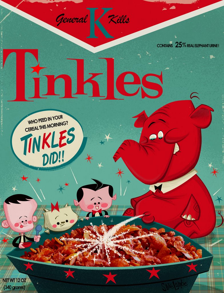
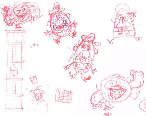
Commentary? This one was a wee bit tricky to figure out. My first take on this idea was a little more complicated than the result. I've been trying to improve on my posing a lot recently so I decided to try pushing things a little further than I normally would. Get something nice and dynamic vs the stiff crap I usually do. Here are some early thumbnail sketches. Nice and loose...playing with ideas, figuring out composition.
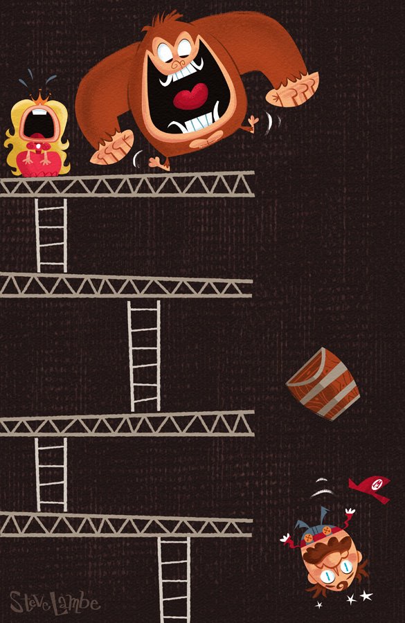
Starting to play with Kong's shape. Maybe he could be shaped like a banana with arms? Then where do I attach that right arm? Bah!
 The end result was this, which I was pretty happy with (except for the shatty princess). Interesting shapes, minor symmetry.....a teeny monkey ceck.
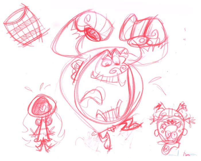 Well...when I tried frankensteining that all together in photoshop, on top of that thumbnail up top, I ran into problems. It just didnt read. Things felt too complicated and it just wasn't communicating. I think it was the shapes. If this was a closeup, it could work.....but as a long distance shot, it didnt. I had to try and simplify the shapes. Anyhow, after more sketching I got this:
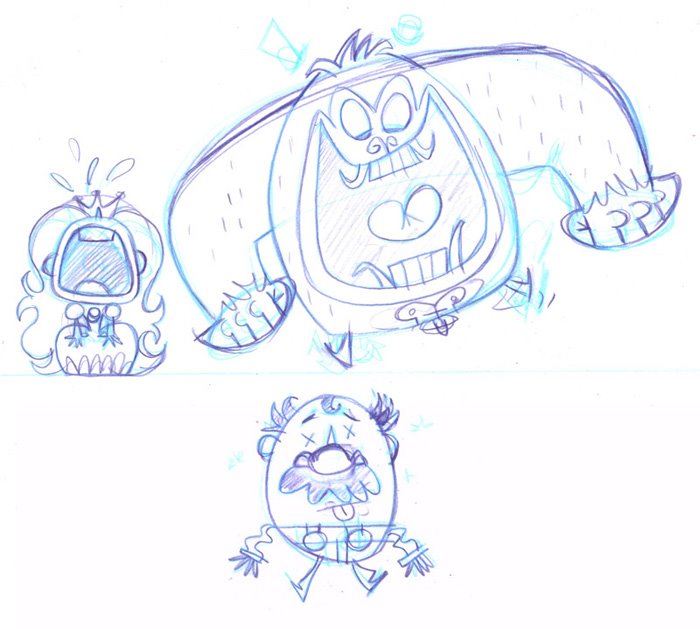 Better! Now theres visual clarity...rectangle Princess, square-ish Kong, and an oval Mario. Is it as exciting posing wise as the earlier version....no. But the shapes are much simpler and they communicated a lot more clearly. It's definitely not perfect...especially all that symmetry.. grrr!! But it works.
I'd be interested to hear other peoples take on this. Did I make the right choice? Was there a better solution? Am I sweating over this stupid thing too much? Yes...shaddap, Steve.